New design
2021-04-25by Fabian ZimmerLast edited on 2021-05-15
It’s spring and it felt like a good time to finally update my website design. I’ve happily used Hugo and the great Hello Friend NG theme by rhazodon but I had plans (who doesn’t?) to create my own design. Family, work, pandemic and stuff got in the way, as was almost inevitable.
So what happened? At some point in the last six months fargerio told me about Tailwind CSS and how he really enjoyed working with it. I am most certainly not a designer and in my past experiences with CSS frameworks I always struggled to make them my own. Bootstrap always looked like Bootstrap. It was fine. I had never heard of a utility-first CSS framework and was a bit intimidated - hello class="mb-16 ml-2 font-sans text-xs prose text-gray-700 sm:prose lg:prose-lg sm:mx-12". Then again, the ability to rapidly bootstrap a page and iterate on it bit-by-bit was appealing.
I set myself the following design goals for my new theme:
- No external resources - self-host fonts and icons
- No Javascript - the blog is mainly text
- Inspired by Hello Friend NG - I just like the looks
After several months of iterations between caring for my daughter, life admin, and trying to stay sane, I finished a first viable theme! I can’t quite remember all of the steps but below is a summary of how I got to this point.
Initial setup
I briefly thought about moving the blog to Zola but decided to continue using Hugo, mainly because the ecosystem feels more mature and I could find more tutorials and information about using Hugo and Tailwind CSS.
My main goal was to create my own theme and the Hugo Starter Theme with Tailwind CSS looked exactly like what I wanted. It configures Hugo and Tailwind with sane defaults but it is not meant to be a theme in its own right. Perfect.
I decided to use the starter them as a theme package and happily created qfmantle with:
cd qfma-web/themes
git clone https://github.com/dirkolbrich/hugo-theme-tailwindcss-starter qfmantle
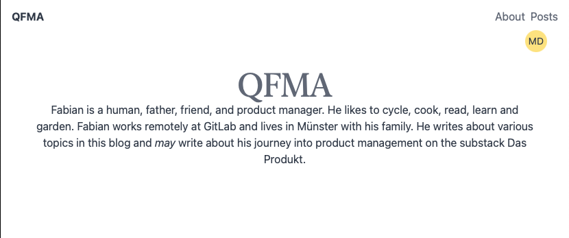
After a bit of cleanup, I was ready to start diving into Tailwind! The defaults looked pretty good already:
Adjusting the theme
I spent most of my time learning about all the different classes that Tailwind uses – the docs are definitely your friend. After a few adjustments this is the single.html file which renders a single blog post:
{{ define "main" }}
<article class="mb-16 ml-2 font-sans text-xs prose text-gray-700 sm:prose lg:prose-lg sm:mx-12">
    <h1>{{ .Title }}</h1>
    {{ $date := .Date.Format "2006-01-02" }} {{ $lastmod := .Lastmod.Format
    "2006-01-02" }}
    <span class="text-sm font-bold tracking-widest text-green-600">{{
    .PublishDate.Format "2006-01-02" }}
    </span>
    </br>
    by  <span class=italic>{{.Site.Params.author}}</span>
    </br>
    {{ if ne $lastmod $date }}
    <span class="mb-1 text-sm font-bold tracking-widest text-green-600 uppercase">
              Last edited on {{ .Lastmod.Format "2006-01-02" }}
    </span>
    {{ end }}
    {{ .Content }}
</article>
{{ end }}
Many different classes are applied to each HTML tag and it took me a while to get used to this. It does, however, allow me to style parts of the blog post in a very iterative way. For example, <span class="text-sm font-bold tracking-widest text-green-600 uppercase"> creates the nice looking green small caps effect for the “Last edited on” section. The prose class is part of Tailwind’s typography plugin which styles the markdown content with sensible defaults. I customized this a bit but more on that later.
One advantage of using Tailwind is that almost all of the styling happens in the HTML itself. This makes it easy to use “blocks” or “components” to build up the UI. Tailwind UI offers many building blocks from the makers of Tailwind but the price was somewhat steep for me. Luckily, the awesome-tailwindcss list has many options for UI libraries, components and templates. After searching for a while, I ended up using the centered headers by wickedtemplates. This made it much easier to create an appealing landing page for the webpage!
One design touch that is also present in Hello Friend NG is the blinking command prompt. I liked the playfulness of it and it also means I don’t have to design a new logo for the homepage. Tailwind makes creating the same effect pretty easy using inbuild functionality:
<a href="{{ .Site.Home.Permalink }}"
   class="flex items-center text-xl font-bold text-gray-800">
   ~/qfma/html >
   <svg class="animate-pulse mt-4 pl-1 align-bottom
               w-4 h-0.5 fill-current text-green-600">
               <rect width=40 height=20></rect>
   </svg>
</a>
It is as simple as styling the svg tag and using animate-pulse to create the same effect.
Icons
Remember when I said I did not want to include any external resources? Turns out that the default for icons is to just include a very large external file or to manage this via npm. I did not really want to include a large file via a CDN and looking at the different ways to install Font Awesome I wanted a simpler way. I decided to just include the svg data directly for the few icons that I needed. They are all available via Font-Awesome/svgs on GitHub and contain the correct attributions for FontAwesome’s free licenses. This only loads the icons I want directly - no CDN required.
<a href="mailto:replace-with-my-first-name@qfma.de"
   class="text-gray-800 hover:text-green-600">
    <svg width="24" height="24"
         xmlns="http://www.w3.org/2000/svg" viewBox="0 0 512512">
        <!-- Font Awesome Free 5.15.2 by @fontawesome -
        https://fontawesome.com License -
        https://fontawesome.com/license/free (Icons: CC BY
        4.0, Fonts: SIL OFL 1.1, Code: MIT License) -->
        <path d="M502.3 190.8c3.9-3.1 9.7-.2 9.7 4.7V400c0
        26.5-21.5 48-48 48H48c-26.5
        0-48-21.5-48-48V195.6c0-5 5.7-7.8 9.7-4.7 22.4 17.4
        52.1 39.5 154.1 113.6 21.1 15.4 56.7 47.8 92.2 47.6
        35.7.3 72-32.8 92.3-47.6 102-74.1 131.6-96.3
        154-113.7zM256 320c23.2.4 56.6-29.2 73.4-41.4
        132.7-96.3 142.8-104.7 173.4-128.7 5.8-4.5 9.2-11.5
        9.2-18.9v-19c0-26.5-21.5-48-48-48H48C21.5 64 0 85.5
        0 112v19c0 7.4 3.4 14.3 9.2 18.9 30.6 23.9 40.7 32.4
        173.4 128.7 16.8 12.2 50.2 41.8 73.4 41.4z"
        fill="currentColor" />
    </svg>
</a>
Typography
Tailwind resets pretty much everything by default. This is great for UIs but ends up requiring a lot of work when it comes to typography. By now this is pretty much solved by using the tailwindcss-typography plugin. This gives you access to the prose class, which is used to provide typographic defaults for any vanilla HTML - in particular HTML that is rendered by something else like Hugo’s markdown!
The defaults are great and you can also make them responsive but I wanted to customize things a bit. This is possible but not super easy to figure out. The developers are pretty transparent about this being low-level which I suppose is a polite way of saying “You will google your way to success and tinker around a bunch until things work”.
Here is what I ended up with in my tailwind.config.js:
module.exports = {
  theme: {
    extend: {
      fontFamily: {
        sans: ['Lato', 'sans-serif'],
      },
      typography: (theme) => ({
        DEFAULT: {
          css: {
            color: theme('colors.gray.800'),
            a: {
              color: theme('colors.gray.800'),
              '&:hover': {
                color: theme('colors.green.600'),
              },
            },
            h1: {
              color: theme('colors.gray.800'),
              '&::before': {
                content: '"# "',
                color: theme('colors.green.600'),
                fontWeight: theme('fontWeight.normal'),
              },
            },
            h2: {
              color: theme('colors.gray.800'),
              '&::before': {
                content: '"## "',
                color: theme('colors.green.600'),
                fontWeight: theme('fontWeight.normal'),
              },
            },
            h3: {
              color: theme('colors.gray.800'),
              '&::before': {
                content: '"### "',
                color: theme('colors.green.600'),
                fontWeight: theme('fontWeight.normal'),
              },
            },
            h4: {
              color: theme('colors.gray.800'),
              '&::before': {
                content: '"#### "',
                color: theme('colors.green.600'),
                fontWeight: theme('fontWeight.normal'),
              },
            },
          },
        },
      }),
    },
  },
  variants: { },
  plugins: [
    require('@tailwindcss/typography'),
  ]
}
There are a few different things going on here:
- I use a different font for sans, namely
Lato. More on this below. - I style links differently. The color of links is set to
colors.green.600on hover. - I figured out how to add a green hashtag before rendering
h1, h2, h3, h4tags. This exposes some of the markdown elements and I thought it was a fun brutalist touch. - I also require the tailwind typography plugin.
Most of my time spent here was just trying to figure out where to put things and how to put it into the right format. It was a bit tedious but I am happy with the results.
Local Google Fonts
The simplest way to change fonts to something more exciting is to use Google Fonts and include them via a link tag or an @import. I wanted to self-host these fonts locally (remember: no external resources!) and I used the google-webfonts-helper to download fonts and CSS. This is a great tool and I am always positively surprised how many of these tools are freely available. Thank you Mario!
I downloaded the fonts, added them to /static/fonts and included them in my sites.css:
/* lato-300 - latin */
@font-face {
  font-family: 'Lato';
  font-style: normal;
  font-weight: 300;
  src: local(''),
       url('/fonts/lato-v17-latin-300.woff2') format('woff2'), /* Chrome 26+, Opera 23+, Firefox 39+ */
       url('/fonts/lato-v17-latin-300.woff') format('woff'); /* Chrome 6+, Firefox 3.6+, IE 9+, Safari 5.1+ */
  font-display: swap;
}
I only used the woff and woff2 fonts because I don’t need to care about compatibility to old browsers. The only thing left to do was to extend the tailwind configuration:
extend: {
    fontFamily: {
    sans: ['Lato', 'sans-serif'],
    },
A minor hiccup was me forgetting to restart the hugo server. I spent at least 30 minutes trying to understand why the fonts were not loaded. A simple restart fixed the issue.
Finally, a couple of words on my editor setup. Working with Tailwind is pretty easy but to help me I installed two Tailwind extensions for Visual Studio Code. Tailwind CSS Intellisense provides some conveniences, such as autocomplete and because I enjoy some sort of consistent order, I started using the nifty Visual Studio Code extension Headwind that sorts the classes in a mostly meaningful way. Nice!
Final thoughts
I really enjoyed the process of creating my own theme and using Tailwind CSS. I am not a designer and so far failed to customize existing CSS frameworks or create any themes. Working with Tailwind feels very iterative – I can tinker and make some small changes until I run out of time. Picking up where I left a few days later always felt easy.
I’ve also not worked on anything resembling web design for at least five years. This meant I had to learn a lot about the available tools but I came away impressed by how much the ecosystem has evolved. It feels empowering to create a blog and a new theme using mainly open source components and I have a few things on my mental list already that I’d like to improve.